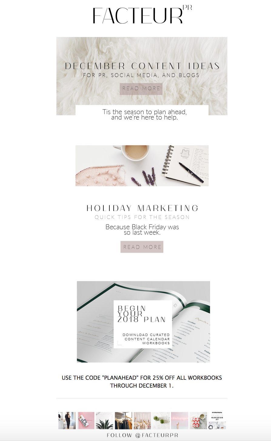
Refreshingly simple: meet our new e-mail newsletter
If you haven't read our blog post on the importance of e-mail marketing, start here! At FACTEUR PR, we truly believe in the value of an e-mail subscriber list, because while Instagram could disappear tomorrow, our e-mail list is something we arguably own.
Last week, we were super excited to unveil our new e-mail newsletter design! But first, a few reasons why we decided to make a change.
1.) More people are reading their e-mails on mobile devices than their desktops.
Depending on your business, your e-mail communications sound better coming from a person and written more like a narrative or an message to a friend. This is particularly a good strategy if you aren't doing a lot of linking from your newsletter to your blog or website to further storytell. However, our e-mail newsletter's primary objective is to inform our readers. Our newsletter comes out once a month, so it makes more sense in terms of real estate to link to our blog for full stories at this time. Therefore, we shortened the copy in our newsletter.
2.) Our previous layout was restrictive.
Our old layout featured a single-double-single column approach. This lent itself to predictability every month for our readers, but also restriction for us in terms of what content to include. With our new layout, we can extend our content with the addition of sections heading vertically down the screen, which aids in readability, too, as folks are typically scrolling up and down on their mobile devices and desktops.
3.) We just needed a change.
It started one day with the realization that our logo was too big. We love our logo and have no plans to change it and we feel it still embodies our brand. But the rest of the newsletter wasn't putting our best foot forward. After all, we do provide e-mail marketing services for our clients. Therefore, we decided to 'walk the talk' and create a layout that made us proud to send out every month and hopefully makes our readers want to open it - both for the great content and its aesthetics. Take a look at it below, and tell us what you think!


